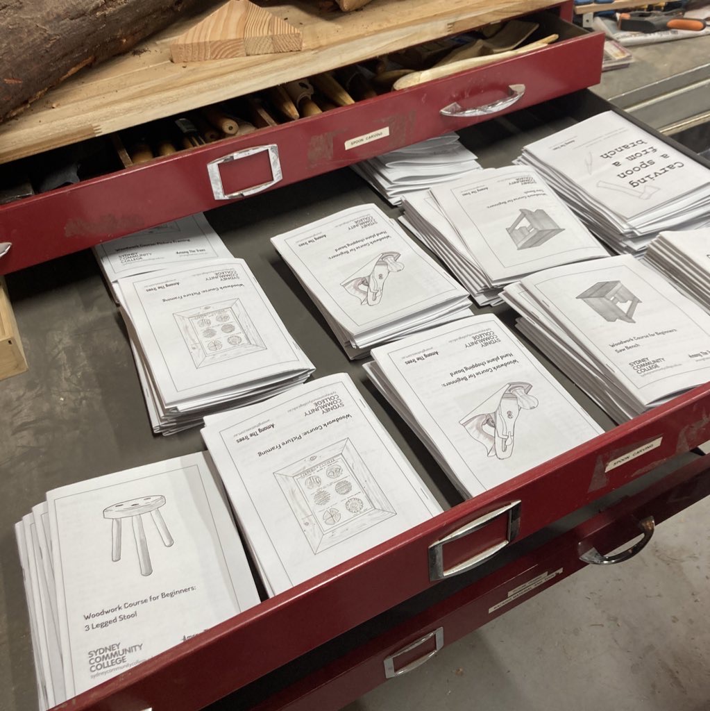
I just wanted to share a bit of behind the curtain at some of the illustrations I’ve been doing for Among The Trees’ course material.
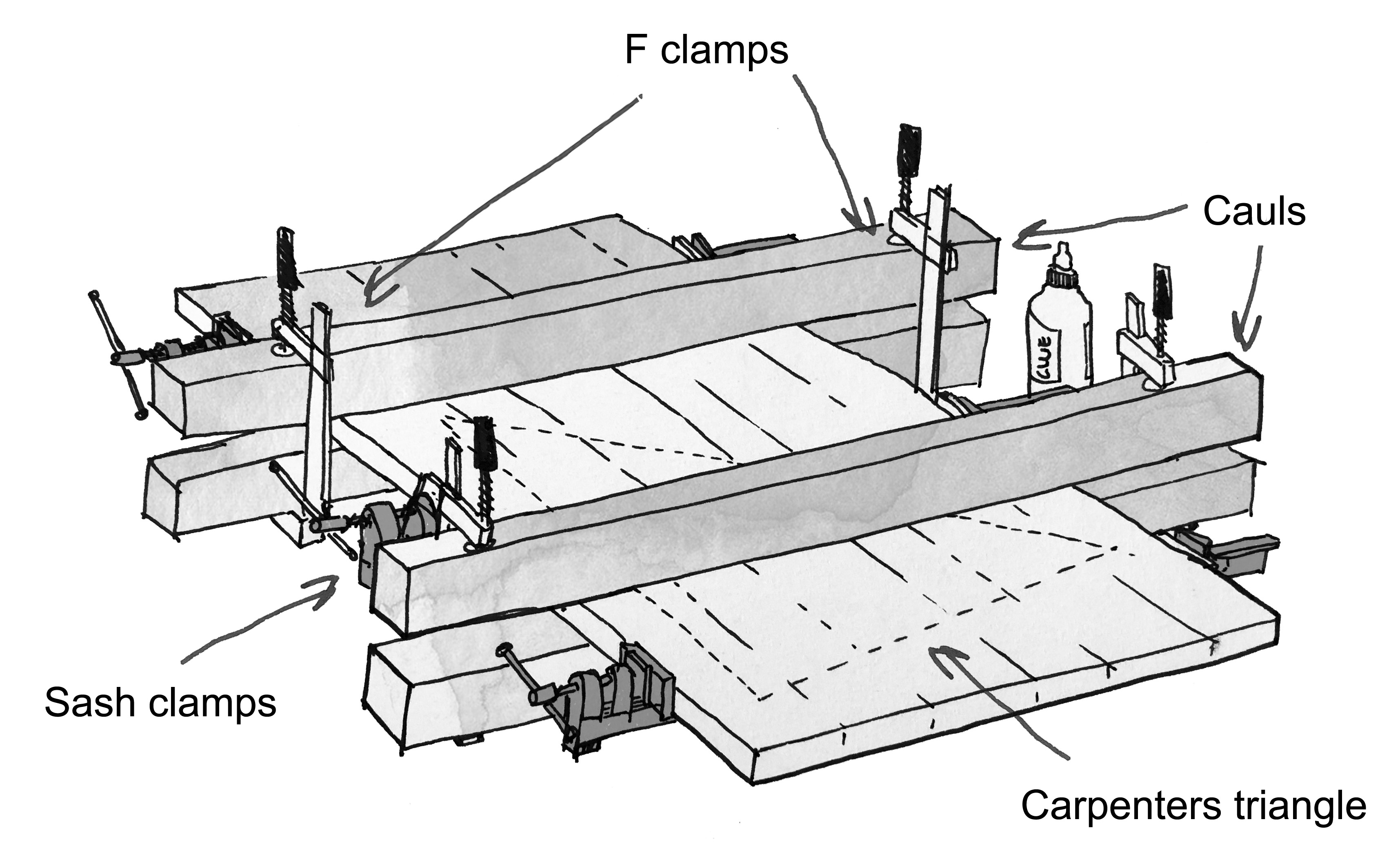
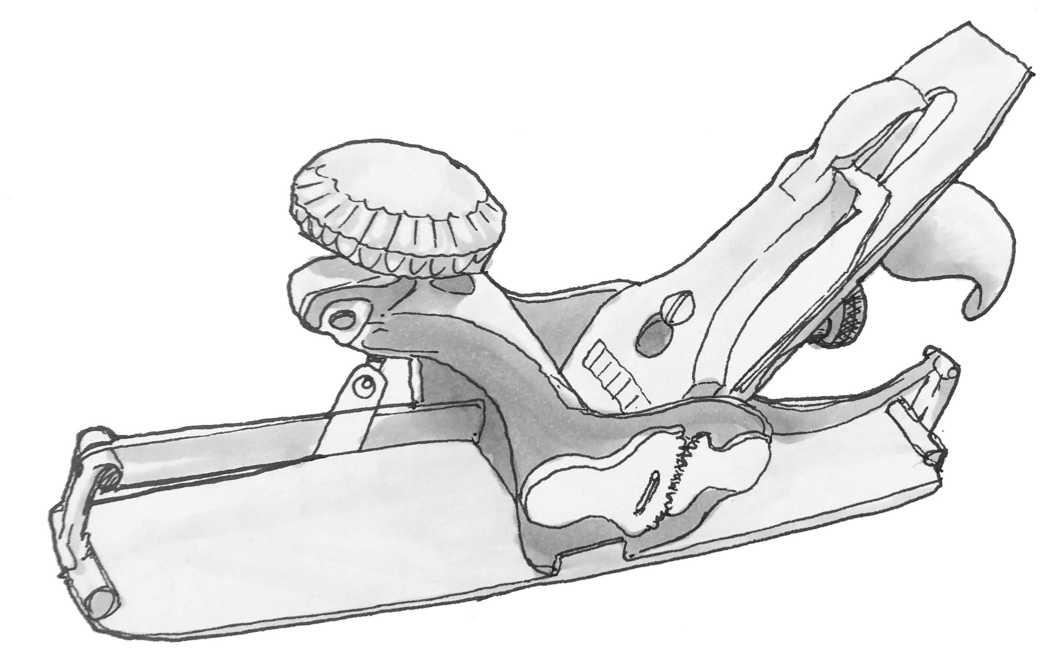
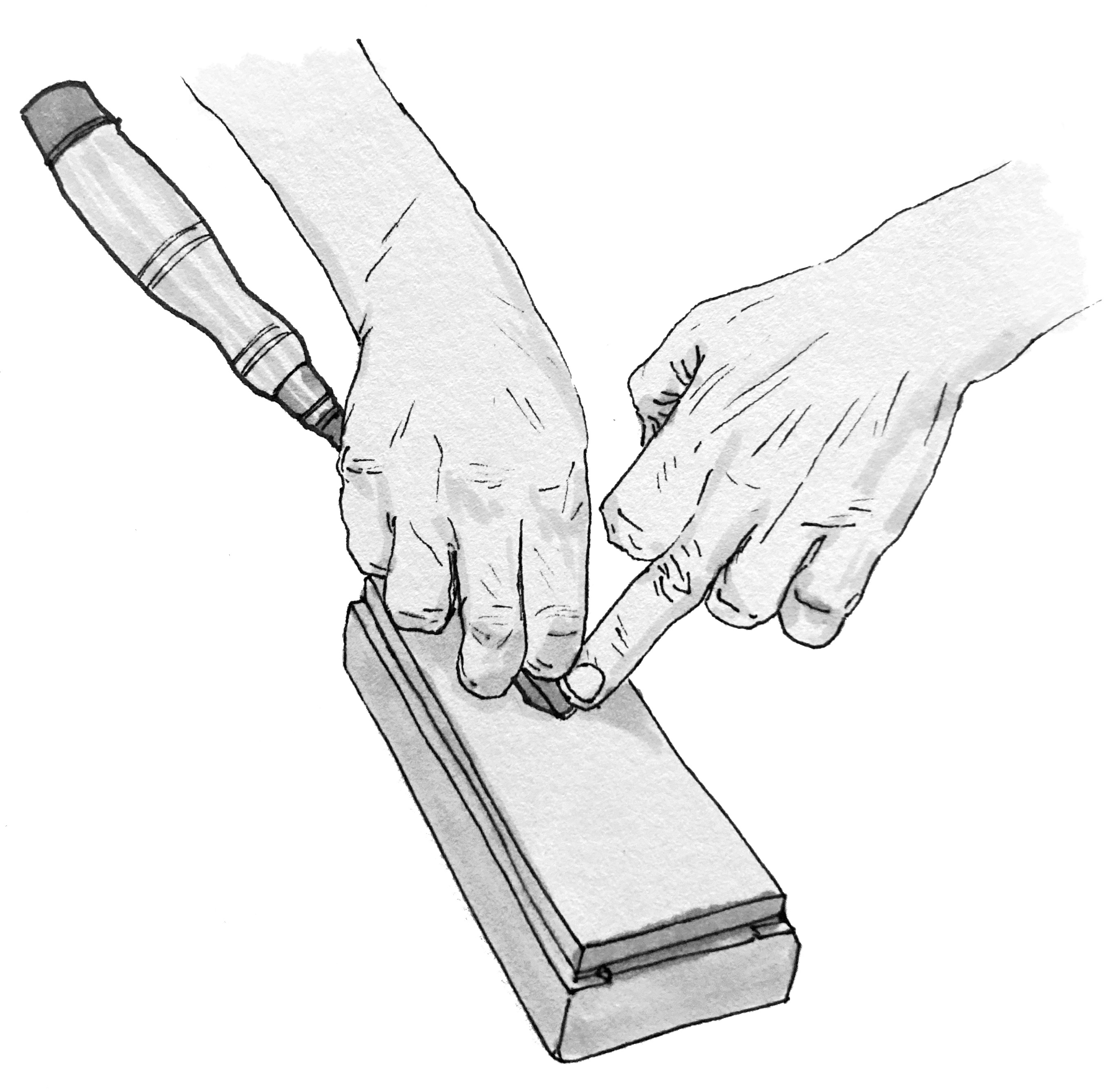
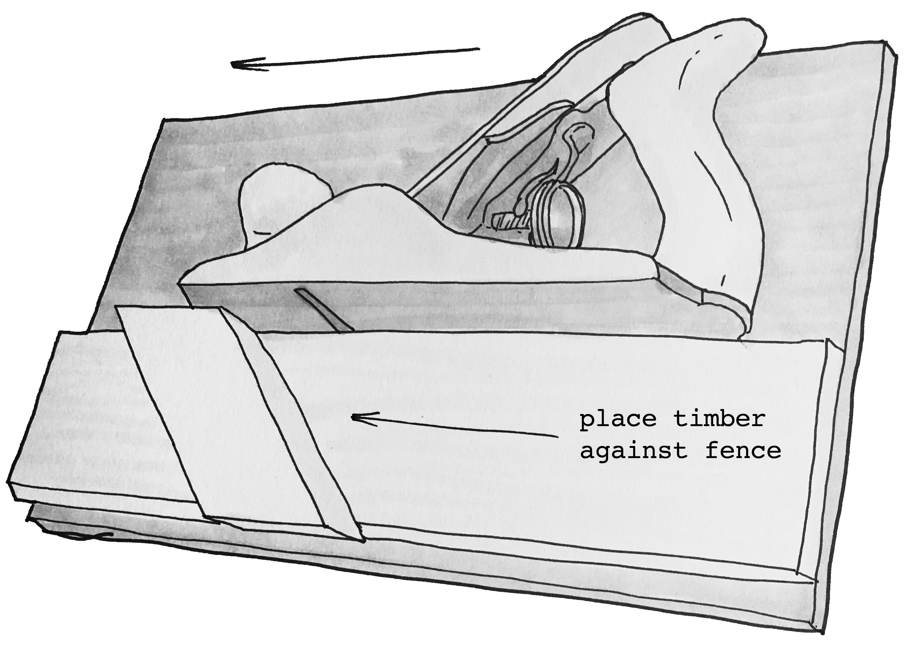
When we started producing some course material for our students we had the idea of making them stand out a bit from other instructional pieces by including some instructional drawings. I’m not a particularly skilled artist, and especially have little skill in drawing freehand, but I enjoy linework and shading and so figured out a method of tracing photographs we had taken for the purpose and then hand inking and shading them for a semi-rough hand drawn feel that still has a nod to technical drawing.
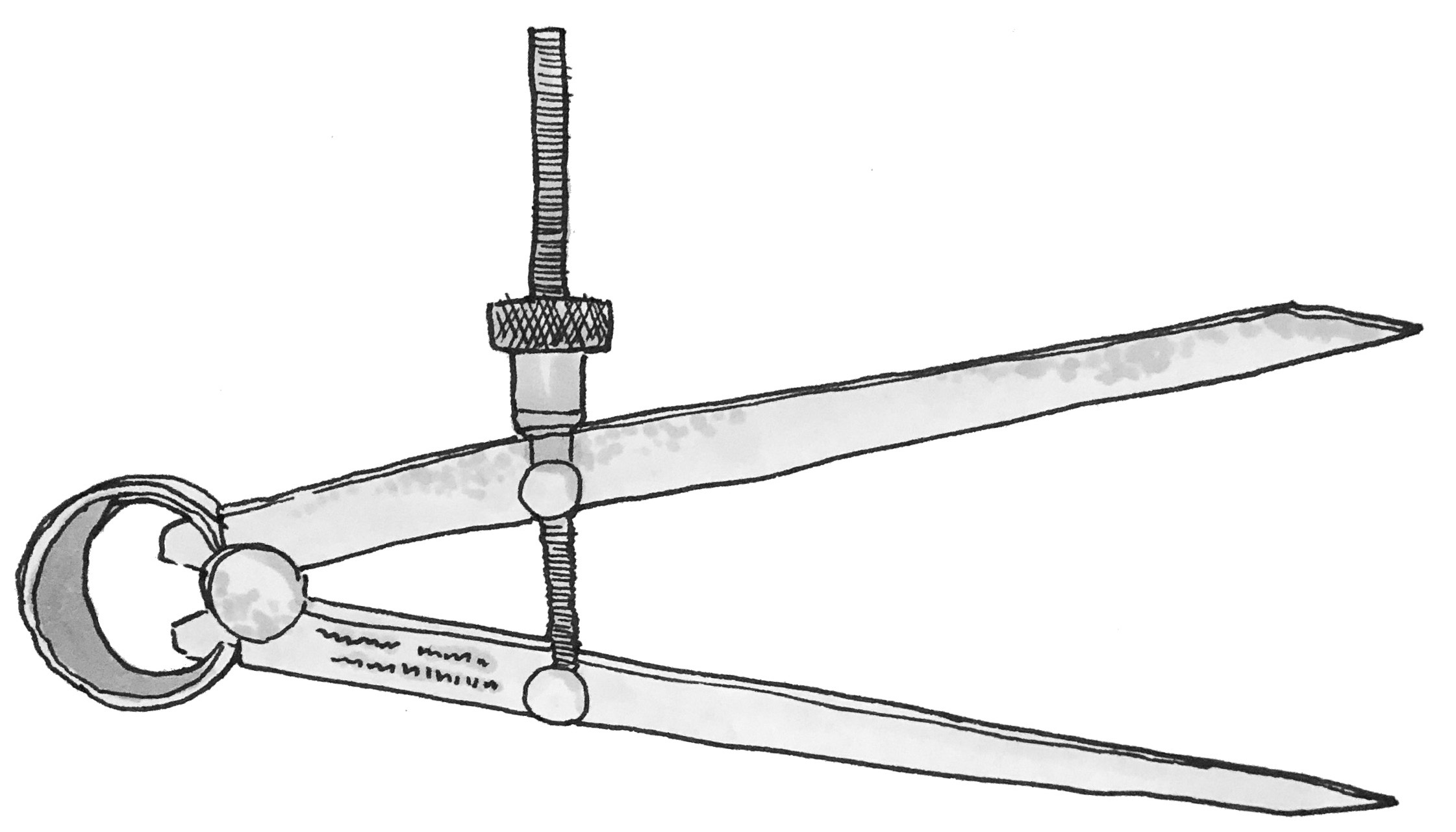
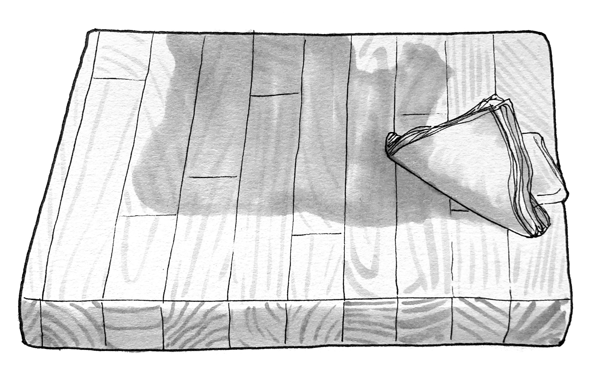
Mostly this process is pretty simple – we stage and shoot the photos we want to illustrate particular techniques or ideas and sometimes do some workshopping to figure out if the drawing is helpful and clear – but for the covers there’s a bit of a chance to play with something a bit more creative.
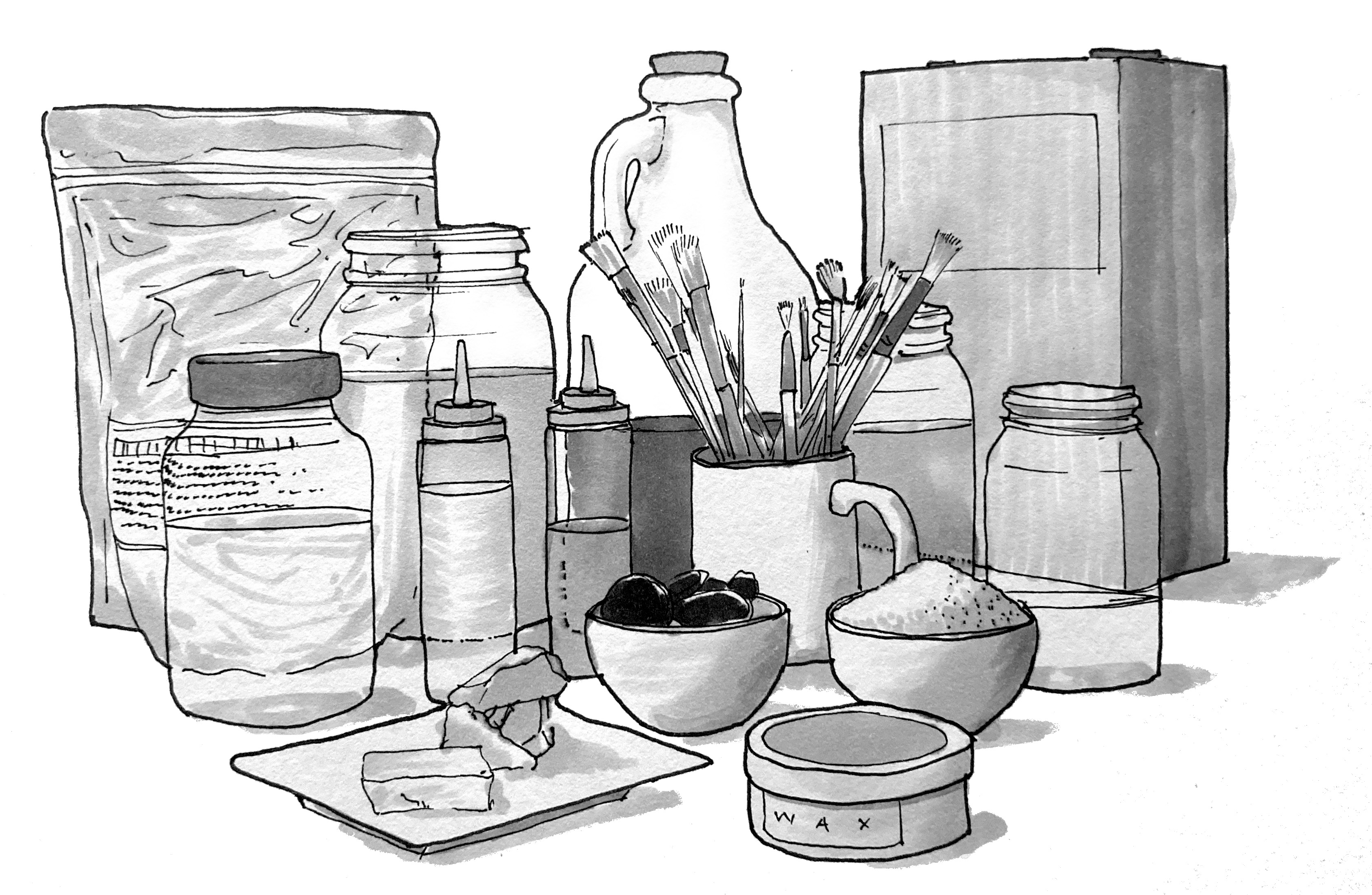
Probably my favourite illustration so far is the cover of our new traditional finishing course, for which we were trying to impart a sense of lots of different materials, concoctions, and possibilities, in line with how the course is a real broad look at a wide range of finishes and why and when to use them.
I started with a few photographs like usual, but nothing quite lined up to have the look that I wanted – the perspective with the camera was always a bit too exaggerated, and it just didn’t feel right, so I scrapped that and started to play with building it digitally instead.
The main layout was done in blender using a range of rough modelled and downloaded elements, just to get a sense of how the layout would work. I knew I wanted some bowls in the front, and a larger can at the back, and a range of jars and bottles, but playing with it in 3D was a really quick way of getting a good sense of how it would look. I then slapped an outlines filter over the lot in blender and exported it to Photoshop.
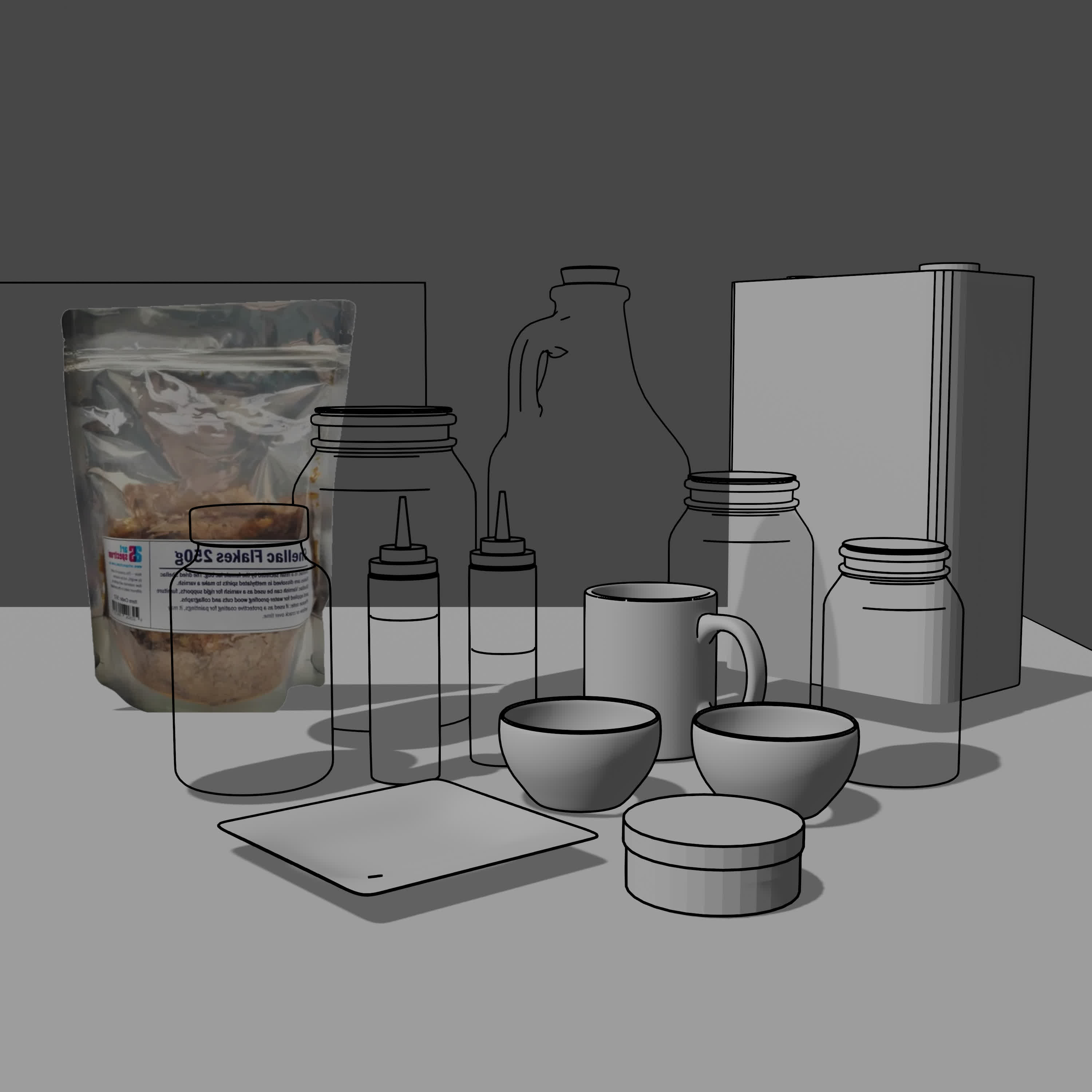
From there, it was just adding in some photographic and stock elements that could be traced later – waxes, button shellac, a foil packet and brushes.
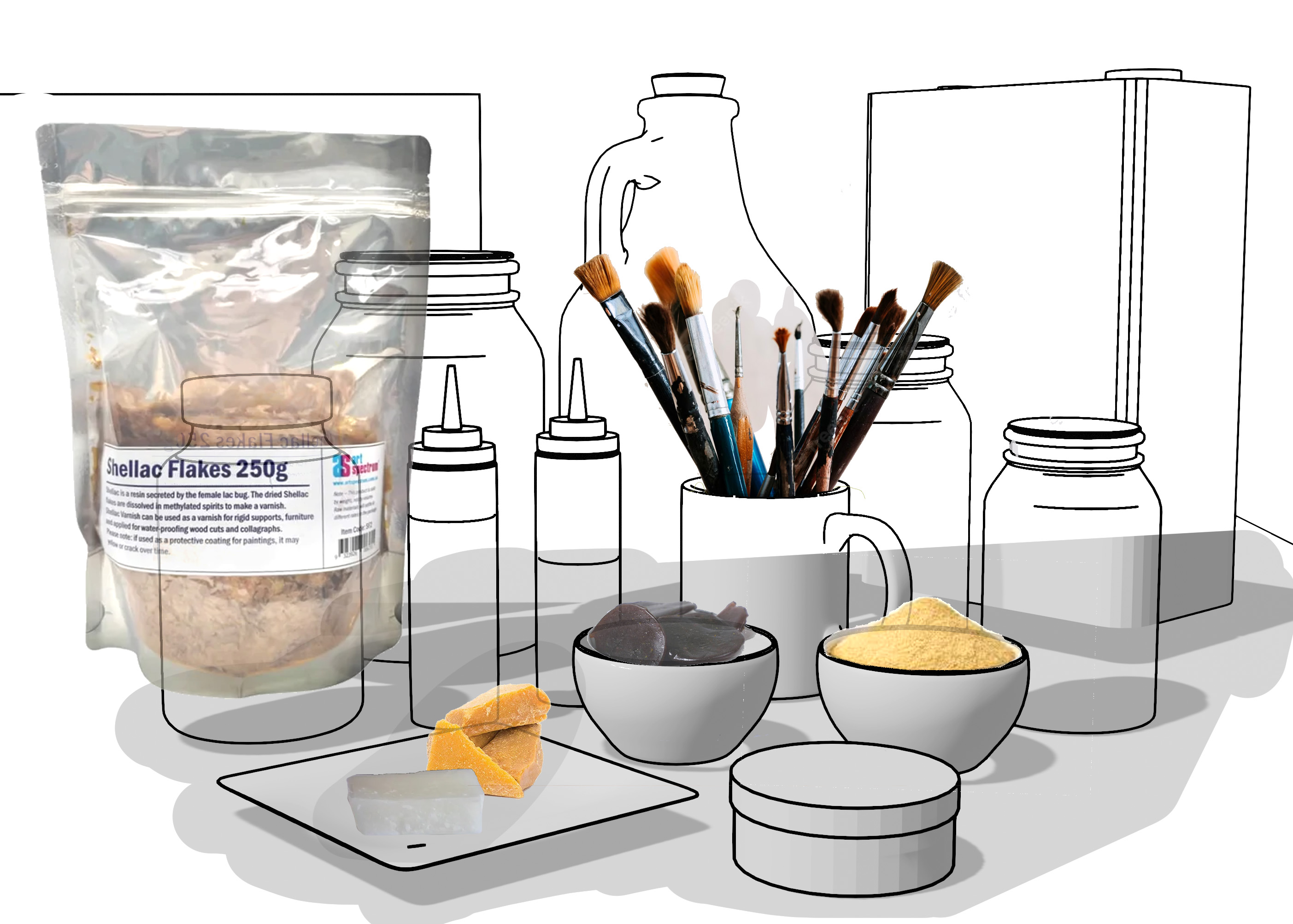
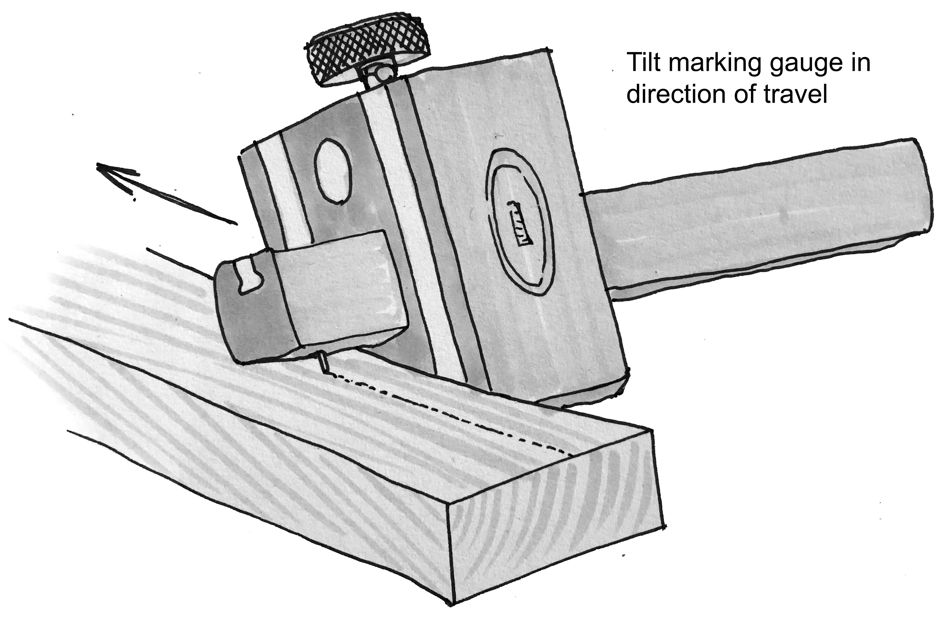
This was then printed and traced using a small lightbox. I use a couple of different line thicknesses (0.1, 0.2 and 0.8 mainly) to demarcate points of interest or outlines. For all of these illustrations I just photograph them square on, I don’t even really bother scanning them as the photos are high enough quality for print. I like to get a photo of the unshaded linework, even though we don’t use them, just in case I totally fuck the shading!
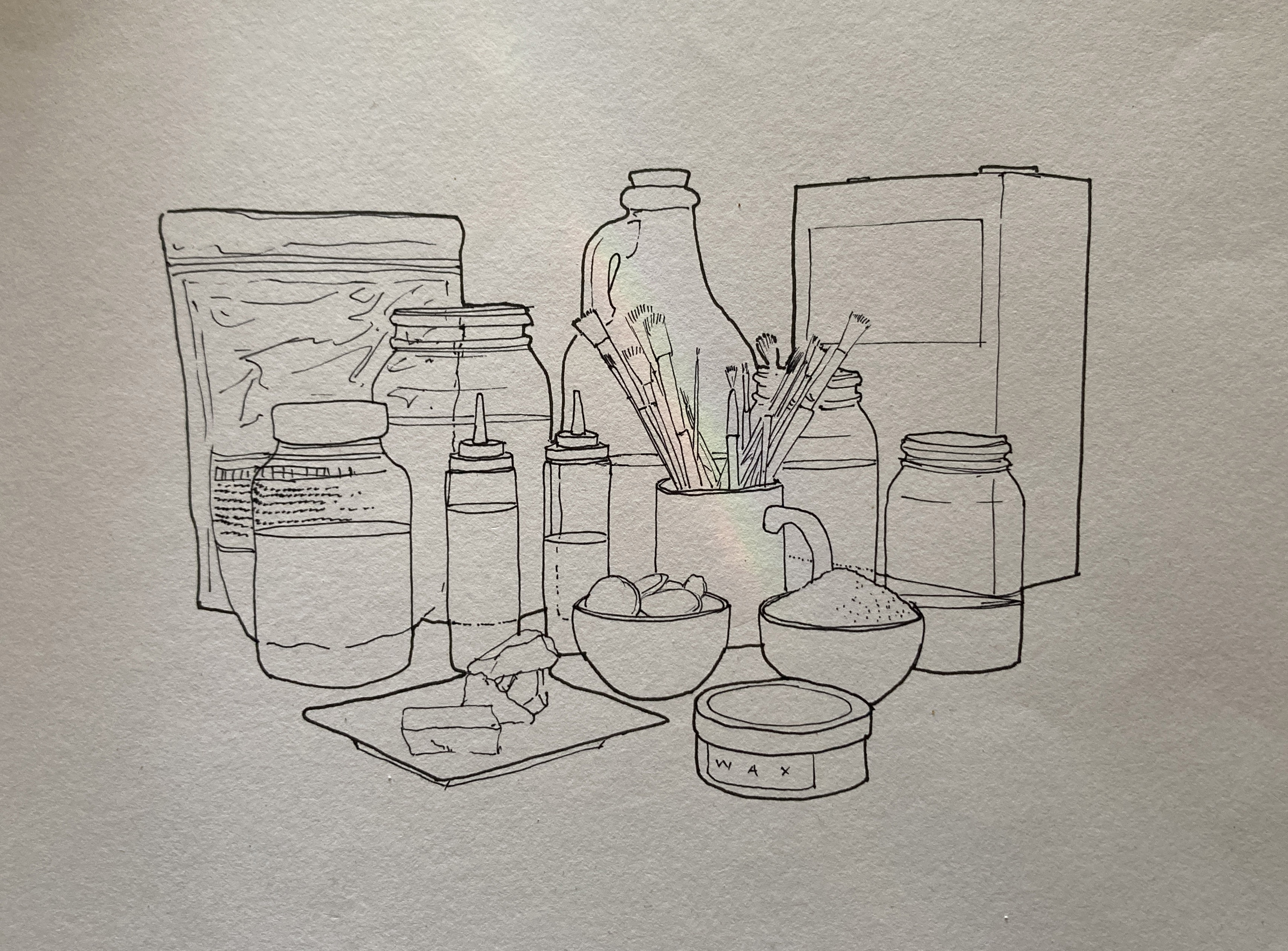
Finally I shade the illustration using 5 different shades of copic neutral greys. When I was doing the first few illustrations I only had 2-3 shades, but as I’ve done more I like being able to blend even more shades. The original blender file also allowed me to place a light and get a rough sense of where the shadows would fall, so I shaded those in too.
A quick photograph and level adjustment in Photoshop and it’s ready to print!